The making of #WomenLead's new logo
Designer Nithya Subramanian shares all that inspired the final imagery - from an iconic photo to a bold, feminist vision
Hello!
As we mentioned in our newsletter over the weekend, something’s been brewin’ ☕ here at #WomenLead. Nearly two years into writing this publication, we finally have a logo and we are so excited to share our new look with all of you!
Getting the logo designed has been made possible all thanks to all of you who have chosen a paid subscription to #WomenLead. Any and all money we receive through subscriptions is used to strengthen and better our work. So a big big thank you for helping us take the work of this newsletter one step up!
It’s our honour that the logo has been designed by one of India’s best (and our favourite) designers, Nithya Subramanian. Nithya spent several days and weeks having conversations with us and taking us along an enriching design process. She has written about the entire journey and how we arrived at the final design - what we were aiming at, what were some design inspirations and what the final logo captures.
Nithya Subramanian on the #WomenLead logo:
I was thrilled when Akshi agreed to let me design #WomenLead’s logo, because I’ve been a longtime reader and admirer and so, in a sense, I was also designing it for myself. The tone of #WomenLead is pitched perfectly towards a no-nonsense, smart and inclusive idea of feminism. Week after week, Akshi highlights the grinding work that women around the world do as they take one step forward and often two steps back on the slow march towards equality. I felt these things without articulating them as a reader. Now, as a designer, I had to not only articulate them, but give them visual form. Luckily, I had Akshi right there to talk these ideas over with.
Bold, inclusive but not stereotypical
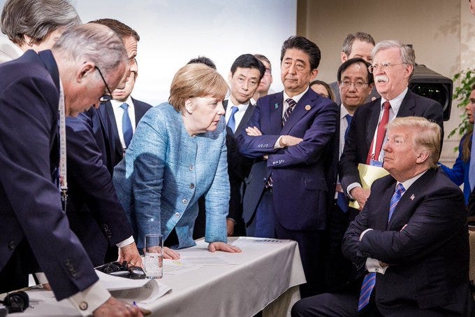
Akshi told me very clearly that the logo needed to be memorable, ought to communicate the values of the newsletter, and that it had to stand out on the infinite scroll as well as on Substack. We wanted to make something bold and in-your-face, but without a hint of the #girlboss or superwoman stereotypes. If the aesthetic of the newsletter were a single photo, it would be this iconic one of former German Chancellor Angela Merkel and other G7 leaders confronting former US President Donald Trump in 2018.

These were the early sketches I made for the logo, some of which I then turned digital.
The original idea was to use the female symbol, but as Akshi pointed out, the symbol isn’t inclusive. So when I made logos using it, I was inspired by the UN Women logo design that turns the horizontal bar in the women symbol into an equal sign.
Playing with charts and hashtags
The circular portion of the symbol – originally symbolising Aphrodite’s mirror – was turned into a donut chart showing 25%, which is the percentage of women in national parliaments around the world.
I then played with the semicircular parliament chart to show the same 25% idea. The remaining circles were all shown blank, showing how many seats they could potentially occupy. I was thinking of the late US Supreme Court judge Ruth Bader Ginsburg:
"When I'm sometimes asked 'When will there be enough [women on the Supreme Court]?' and I say 'When there are nine,' people are shocked. But there'd been nine men, and nobody's ever raised a question about that."
I also played with the hashtag in the name, turning it into a statement that the feminist goal of equality hasn’t yet been met.
Women waiting for the world to catch up with them
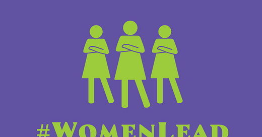
Then, just before I was to show my ideas to Akshi, I went back to the Merkel photo and thought of how it made me feel. Looking at her, I felt her weary impatience at having to deal with so much nonsense in order to get things done. I wanted to create a woman who embodied that sort of tired competence: waiting for the world to catch up with her. I wanted this to be every woman, and every woman leader I look up to. So I went with the female icon, the most generic isotype of woman, and changed her stance:
This was the logo Akshi picked, and then we began to play with colour and line. I tried sober, muted colours, but that wasn’t the tone we wanted to strike. I also varied the women’s clothes to show they were diverse, but we realised we didn’t really need to do that.
As women, we want to be seen, for our competence to be recognised, and to help one another out as we navigate this world of power that we were never intended to occupy. And so for our final logo, we are going with two versions: yellow and red, loud and joyous colours of celebration, and purple and green, the colours of the Suffragettes.
Follow Nithya Subramanian on Twitter / Instagram and subscribe to her newsletter.
If you would like to help strengthen and support the work we do, you could purchase a paid subscription to this newsletter. It costs little but goes a long way to keep us going. Thank you!


Superb. Love the stance. I use it all the time, with my eyes rolling.
May the logo get a global recognition very soon!